Harpers Design Awards 2024: The full rundown
Beauty may be in the eye of the beholder, but great design is a finely tuned skill. Andrew Catchpole highlights the best of the crop at this year’s Design Awards.
Year after year what makes our Design Awards one of the most enjoyable events we run is the variety and qualities presented to the judges by the assembled wines, spirits, beers, RTDs and low & nos, which also span every conceivable corner of the drinks world. Yes, the entries are lined up on tables like a regular tasting. But this session inverts the norm, eschewing the liquid inside to instead consider the presentation and packaging, essentially to assess whether that can be a help or a hindrance to that drink inside. And, as such, it delivers a highly refreshing look at the drinks world, considering how well (or otherwise) differing products have met their design brief, which also translates beyond immediate appeal to suitability for their intended channel.
To add rigour to the process, our judges are drawn both from the design world and from the trade to ensure that both ‘sides’ are represented and views are shared from those differing vantage points. What is noticeable, though, is that in the overwhelming number of cases, good and great design shines through, with much agreement on those products that have cracked it; the ones oozing ‘pick me up and try me’ appeal, whether it be an unpretentious but catchy wine range at Asda, a stunning, industrial-chic premium vodka or an artily labelled Aussie vino aimed at the smart restaurant world.
The wines presented were particularly commended this year, with ever more innovative designs, along with some signs of packaging beginning to move on too, including a wholly reusable ‘bottle’, where the sustainability credentials folded in the sporadic re-touching up of the container when use has tired the look. There was also a consensus among the judges that producers that are serious about their design and packaging are more likely to care about what they put in the bottle. All of which makes for a fascinating discussion around that liquid inside. Because wines and spirits, like books, are often very much judged by their cover.
Finally, a big congratulations to all of our winning designs, to both the design teams and their clients who have been adventurous and foresighted enough to embrace innovation and change. And congratulations too to our Design Agency of the Year, Denomination, for continuing to add interest and intrigue to our ever-changing drinks world.
JUDGES:
Christine Freeman, art director, Agile Media
James Mackenzie, head of UK marketing, Alliance Wine
Rosie Milsom, head of NPD, Craft Gin Club
Fiona Sprint, senior graphic designer, Butterfly Cannon
Riaz Syed, director, Stonewines
Andrew Catchpole, editor, Harpers Wine & Spirit
THE RESULTS:
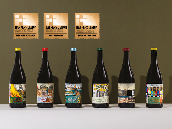
BEST PRODUCT RANGE / BEST NEW WINE / SUPREME CHAMPION
GHOST IN THE MACHINE
Brand owner: Bruce Jack Wines
Designer: Archival
A really compelling standout in the line-up, variously described as “crafted together design” with “layers to unfold”, while the “punchy design would make me think these wines are rich and layered in flavour”. The very novel and tactile wrap-around label was noted as “very clever, very innovative”, with the profusion of imagery and text “gelling together cohesively in an eye-catching and memorable range”. The playful name also won approval, as did the easy-to-remove waxed seal, again suggesting the level of attention to detail. All in all, “a cool label, matching a cool story”, with the “visually arresting design” meaning “I would 100% pick this up off the shelf”. A hands-down clear winner.
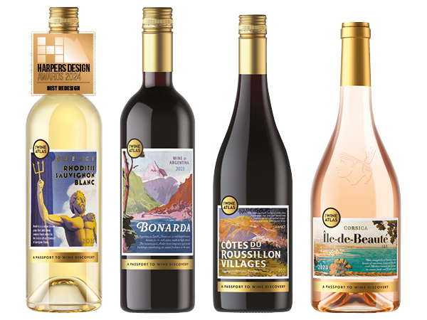
BEST REDESIGN
ASDA WINE ATLAS
Brand owner: International Procurement & Logistics (IPL)
Designer: Barlow & Co
A clever and compelling range featuring retro-feeling postcard-style images that “are a road trip of summer holidays”, being a “really fun way to journey through wine discovery, alluding to travel, with vintage pulls on nostalgia cues”. Judges agreed that the range felt “really accessible” too, “tapping into the romance of travel”, with this combination of “uplifting appeal” and “resonating vintage cues” offering a cohesive yet individual collection of wines that would pull in younger audiences. The range’s “accessibility” was also thought to be well-aligned with the very reasonable pricing, making for a happy “family of wines”.
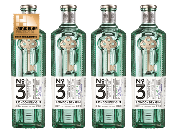
BEST ESTABLISHED PRODUCT
NO.3 LONDON DRY GIN
Brand owner: Berry Bros & Rudd
Designer: Stranger & Stranger
This very striking design stood out for its “clear, original label, complementing a similarly distinctive and original bottle”, praised too for its shape that “tells a story about the six botanicals”, with the whole managing to be “at once textural, with a chunky reassuring feel, but still quite elegant”. Moreover, this “beautifully detailed and sophisticated bottle” had clear appeal for its target audience, while the “sense of storytelling is strong, with the key taking pride of place as a crowning glory”. All in all, a “striking execution” with “excellent finishes”.
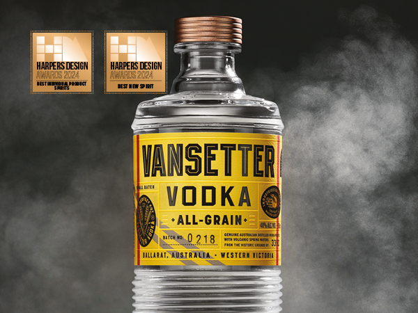
BEST INDIVIDUAL PRODUCT – SPIRITS / BEST NEW SPIRIT
VANSETTER VODKA
Brand owner: Itinerant Spirits
Designer: Chad Michael Studio
A “gritty design, really well executed”, drawing on “heritage and history” to bring together an “industrial/railway of old” feel with the essence of a travel canteen. At once “simple, yet visually appealing”, both the original bottle shape and its tactile, ridged design and retro-cool fonts – all finished to an extremely high degree – were felt to deliver both intrigue and clever shelf appeal. With “personality” and “lots of storytelling and details to unpack”, this felt highly suited to its target demographic, delivering well on the brief. In a crowded vodka market, very much a standout design.
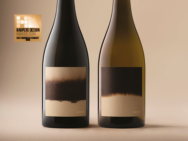
BEST INDIVIDUAL PRODUCT – WINE
NOW (NICOLE OATLEY WINES)
Brand owner: AG Oatley
Designer: Denomination
Described variously as “beautiful from the top down”, an “interesting and arty execution” and “an elegant and visually striking design”, the subtle yet striking monochromatic artwork of the label was “spot on” in conveying a sophisticated on-trade-angled wine. This “modern and clean” approach was backed by the quality of execution, from the screwcap and foil, by way of the artwork, to the “easy-to-read and understand info” on the back. An enigmatic and innovative design that would have customers coming back for more, with the design agency clearly hitting its brief.
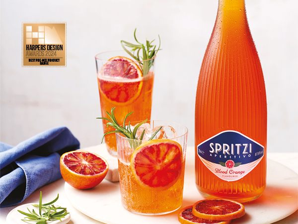
BEST PRE-MIX PRODUCT RANGE
SPRITZI
Brand owner: Tesco
Designer: Barlow & Co
Proving that great design can be not just “very cool, but also fun”, this “understated” winner nonetheless was “contemporary and relaxed” in look, while being “really on brief”. Noted for its commendable innovation within the RTD category, the combination of “laid-back Med lifestyle” feel, where the “bottle and liquid colour do the heavy lifting” when set against “an understated and simple label”, the whole was “very well executed”, from simple cap to “Italian heritage cues”. This, one judge said, was “the kind of bottle you hesitate to put in the recycling bin”.
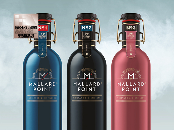
COMMENDATION FOR SUSTAINABLE DESIGN
MALLARD POINT RUTLAND RANGE
Brand owner: Mallard Point Vineyard & Distillery
Designer: Charcoal Studio
As “not something I have personally seen in wine before, with closed loop and aluminium bottles”, this reusable and returnable ‘water bottle’ of wine (with 61% return rates), was described as a “great initiative” for plugging in to reuse rather than recycling. Clearly putting sustainability at the core of its offer, the design was further described as “quirky and clever”, being well-executed and matching the brief by combining “functionality with true innovation”. This brand was also highlighted for doing a spirits/wine crossover successfully within the portfolio, which again impressed.
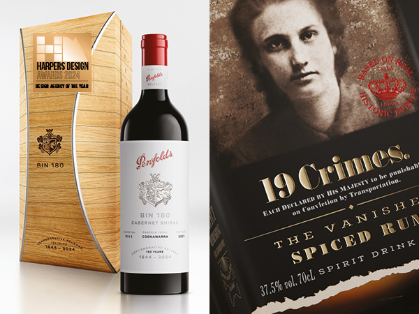
DESIGN AGENCY OF THE YEAR
DENOMINATION
A regular winner of this accolade, Denomination’s lead on what is possible within the drinks world once again shone through, with intelligent, on-brief design delivering much to excite, intrigue and engage. Harpers Design Awards are not just about originality and innovation (although those factors do need to be a given), the brief needs to be hit, bringing together originality with commercial acumen – something the Denomination team clearly achieved over and again. To do so while producing designs of striking singularity and often beauty – see the NOW from Nicole Oatley Wines on the proceeding pages – is a formidable skill, to which we tip our hat, while wondering after the liquids within. Big congratulations from the Harpers team, then, to all at Denomination for being crowned as our Design Agency of the Year 2024.


