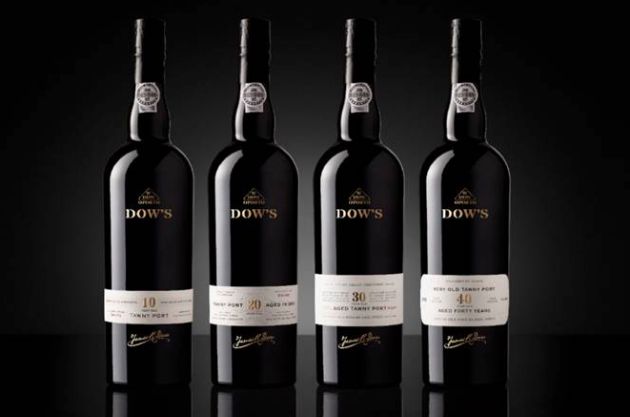
Symington overhauls Dow’s to extend its appeal
Symington Family Estates has given its Dow’s Aged Tawny portfolio an overhaul in a bid to extend the Port’s appeal to a younger audience and beyond Christmas and formal occasions.
Designed to bring the brand in line with contemporary alternatives, the updated bottle has been poured into the “more elegant” Dow’s Vintage black glass while the previously ‘quiet’ W.DOW triangular brand asset has been elevated to stand-out.
The provenance of the drink appears on the stopper, the centre of the bottle and on the label, highlighting its Portuguese origins, with embossing and debossing on the labelling adding to the luxury feel of the product while the handwritten signature of founder James R Dow has been introduced to communicate heritage and craftsmanship.
In addition, the front label now highlights the provenance of the grapes and features the name of the range’s maker, master blender Charles Symington.
The new packaging would help communicate the brand’s place in the premium on-trade market as well as extending its reach, said chairman Paul Symington.
“We have a beautiful new presentation that transmits the supreme quality of these rare hand-crafted Ports. This is a design that is both innovative and contemporary and builds on Port’s fantastic heritage and traditional visual cues,” he said.
Rowena Curlewis, CEO of design agency Denomination, which created the new look, said: “A terrific amount of craftsmanship goes into creating Dow’s range of Ports, but consumers in the UK often see Port as old-fashioned and only for formal or festive occasions.
“Dow’s packaging design was no longer standing out in the category. Competitive brands were all using the same traditional design cues, so Dow’s just blended in with its competitors.”


