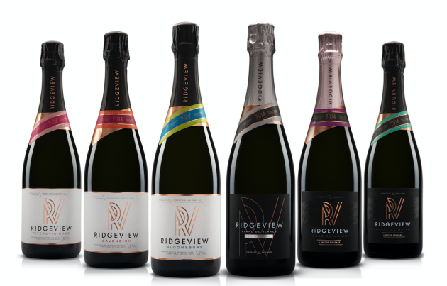
Ridgeview unveils contemporary new look
Ridgeview has given its English wine portfolio a makeover signalling a new direction for the brand.
In a bold move away from Ridgeview’s previous classic and traditional label, the updated label has a celebratory theme inspired by the ‘Life is for Celebrating’ ethos of founders Mike and Christine Roberts.
A new logo highlights the inspiration behind Ridgeview’s name - the view of the South Downs Ridge from the vineyard, while the ‘R wrap around the V’ had been introduced in celebration of “life, family and the beautiful location”.
The new look was a deliberate move away from the more traditional sparkling wine design cues, said chief executive Tamara Roberts.
“We decided it was time to create a new path and celebrate the progressive and innovate nature of our dynamic industry in our branding. We can now confidentially stand on our own two feet and tell the story of our part in the historical rise of English sparkling wine.” she said.
The makeover forms part of Ridgeview’s ambitions to double its output by 2020 assisted by building a new winery last year.
Founded in 1995, all of the producer’s sparkling wines are traditionally fermented in one of England’s only underground specialists wine cellars.


