Harpers Design Awards 2023: The results
Good and great design can only enhance the liquid in the bottle, while communicating much to the consumer. Andrew Catchpole reports back from Harpers Design Awards 2023.
Design can only do so much in terms of helping create or revitalise success in a brand, but the role it does play is incredibly important. After all, while the goal may be to impress so thoroughly with the liquid within that the delighted consumer comes back and makes that second purchase, the first battle is to encourage them to pick it up and buy first time around. And this is where thoughtful, impactful and clever design can make a huge difference, building messaging about quality, authenticity, back story and even lifestyle aspirations into the standout appeal on the shelf or back bar.
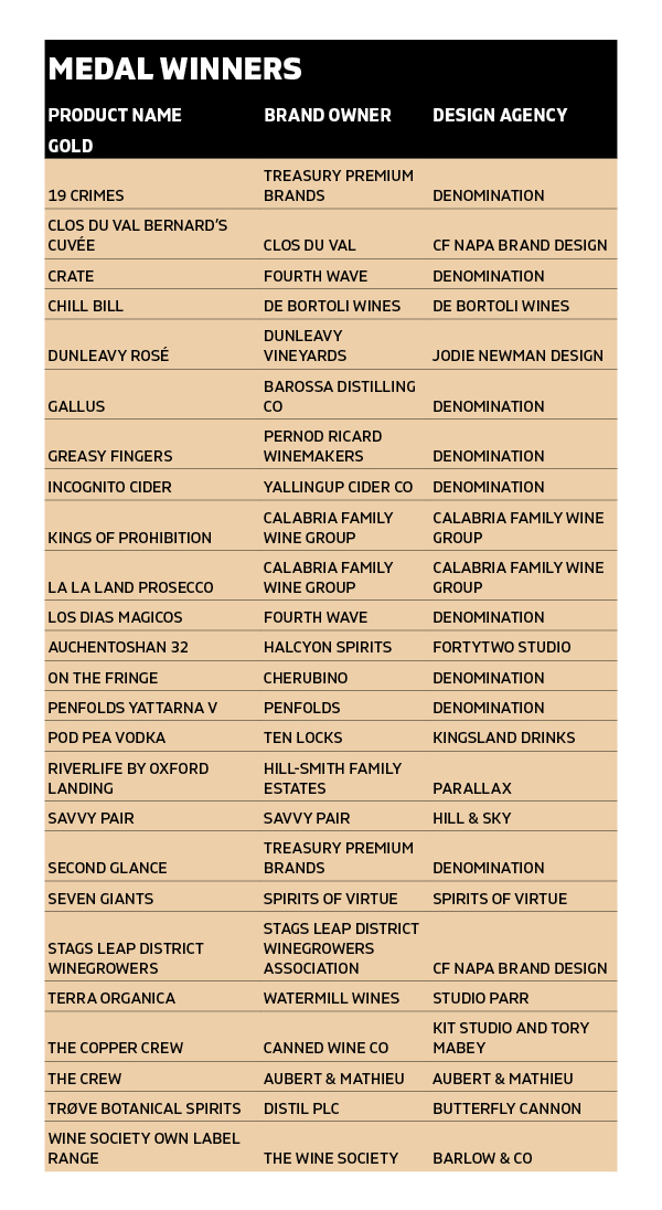
As this year’s winners attest, though, good design and packaging is not simply about looking ‘cool’ or jumping on the latest thematic bandwagon. The more subtle but highly effective redesign of The Wine Society’s own-label range couldn’t be more different from the boldly striking styling of Fourth Wave’s Los Dias Magicos, or the ultra-pared back simplicity of Cherubino’s On the Fringe. All, however, hit their brief, generating much discussion and praise from our judging panel, with their individuality rooted in a deep understanding of the principles of good design.
With regard to the entries themselves, this year delivered a host of excellent products, with much to excite, stimulate and commend. One notable trend – which has been developing over the past few years – is that wines have overtaken spirits and are really at the top of their game, delivering some of the most innovative and refreshing designs in the room. However, both categories, along with cider and lower-alcohol alternatives, gave much food for thought, with many superb designs throughout the various ranges on the judging tables.
One aspect that our judges lend ever greater credence to is that of sustainability in all aspects of packaging, whether that be closures and foils (or lack thereof), recycled paper, biodegradable inks, or a reduction in secondary packaging and lightweighting of bottles. And, in many instances, this is linked to the sustainable credentials of the liquid inside, providing yet another cue for a would-be purchaser who is buying into the right thing.
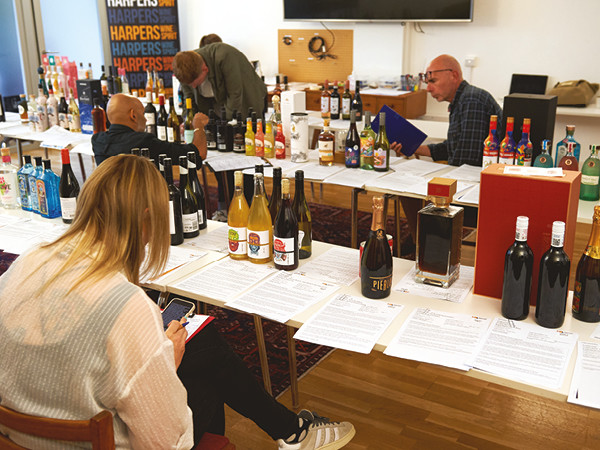
Chairing the judging of our Design Awards is one of the most rewarding and fascinating events in the Harpers calendar, not least because for once – from our b2b perspective – it’s all about a more holistic picture, rather than simply tasting and pronouncing on the liquid inside. And our judging lived up to that expectation.
A big congratulations, then, to our winners and all who entered this year, for making Harpers Design Awards 2023 of such a high standard. We hope you enjoy the results.
Design Awards Judges
Rosie Milsom, marketing manager, Cotswolds Distillery
Riaz Syed, consultant & owner, Stonewines
Bailey Chapman-Hearn, senior designer, Butterfly Cannon
Andrew Catchpole, editor, Harpers Wine & Spirit
BEST NEW WINE, BEST PRODUCT RANGE AND SUPREME CHAMPION
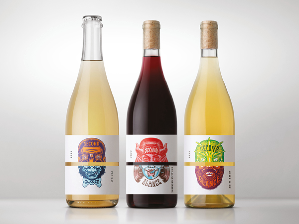
SECOND GLANCE
Brand owner: Treasury Premium Brands
Designer: Denomination
This range comprising pet nat, ‘chillable Grenache’ and amber wines, is right on trend and the “classy” design doesn’t let it down. “Immediately striking, appealing colour schemes, with key info in all the right places”, this had, according to our designer judges, “everything in place”. The range was also highlighted for being “clever and humorous”, while thought an excellent response to consumer insights driving the brief. Moreover, in addition to being “so original and unique, tells the story elegantly”, it was noted that “sustainability is shown rather than thrust upon us”. Simply put, “everything spot on”.
BEST REDESIGN
THE WINE SOCIETY OWN-LABEL RANGE
Brand owner: The Wine Society
Designer: Barlow & Co
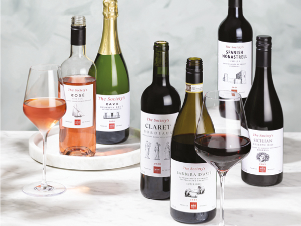
Described glowingly as a “tick-box exercise, having hit every element of their brief”, this subtle makeover nonetheless managed to fully update and modernise the feel of this own-label range, while retaining appeal for those familiar and comfortable with the older style before. The re-tweaked look retains a strong visual identity, carrying the reassurance of The Wine Society brand, but with the addition of subtle imagery – such as old vines from California, a fish for the Riesling – which helps convey much about the wine within. “Really nice cohesion of imagery for the range, each image is unique, but each belongs,” is how one summed up this appealing redesign. “Excellent work,” proclaimed another judge, and clearly all agreed.
BEST ESTABLISHED PRODUCT
TRØVE BOTANICAL SPIRITS
Brand owner: Distil
Designer: Butterfly Cannon
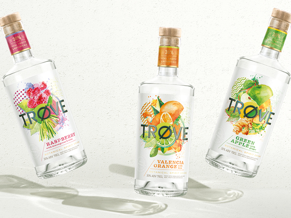
With Green Apple, Raspberry and Orange variants presented, the Trøve rage was a big hit, having the judges warming to its playful, uplifting design. “I like the colour palette, its lighter lines feel happy, convey the summer, perhaps summer fruits and positivity,” said one, summing up the overall impression. The finishes were also considered “very well done – Bravo!”, with the range “super-cohesive, with great use of colour and materials”. There was also added excitement for the brand’s environmental strategy, which included the use of recycled paper, tying all together in a very appealing package indeed.
BEST INDIVIDUAL PRODUCT – SPIRITS
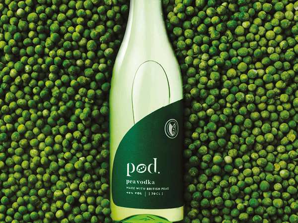
POD PEA VODKA
Brand owner: Ten Locks
Designer: Kingsland Drinks
A lovely looking and also very original design, making the most of this vodka’s unusual but fresh-as-garden distillate, namely the humble pea. “Very clean and contemporary, but also feels honest and authentic; gorgeous bottle/label combo,” was one reaction, with another liking its “fun, quirky and honest” appeal, which “really captured the pea”. Pod Pea vodka was additionally noted for having “great credentials on sustainability”, which tied seamlessly with the overall green scheme of the design. A true original, done very well.
BEST NEW CIDER
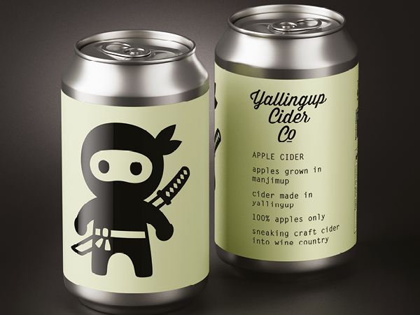
INCOGNITO CIDER
Brand owner: Yallingup Cider Co
Designer: Denomination
“I Love the cute ninja! It’s super eye-catching, clean and intriguing, and meets the brief – just a lovely design,” was one burst of enthusiasm for this superior-looking cider. “This absolutely works, it suggests modernity and freshness,” added another judge, noting the “impactful and bold design”. One judge went so far as to say, “as a non-cider person, I want to try this”, which, coming from a designer, is high praise indeed, summing up the compelling nature of the packaging.
BEST INDIVIDUAL PRODUCT – WINE
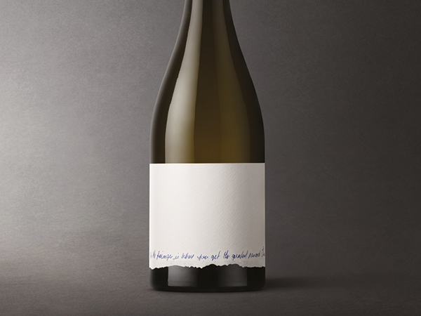
ON THE FRINGE
Brand owner: Cherubino
Designer: Denomination
Described as “interesting, innovative design, love the use of white space”, this pared-back but highly effective presentation “tells the beginning of an intriguing story”. It is “simple but effective”, the whole suggesting “purity”, with the hand-written graphics noted for lending an additional air of “bespoke quality and authenticity”. All in all, a stunning design, perhaps best described by one as “for those in the know, it really works”, and yet while also holding a broad appeal.
BEST NEW SPIRIT
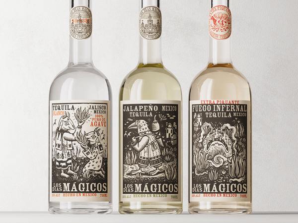
LOS DIAS MAGICOS
Brand owner: Fourth Wave
Designer: Denomination
“Striking images” that are “really impactful” announced a “really nice range, cohesive but with good differentiation”, being at once “innovative, yet solid”. The “bold and characterful” label “captures the story of the brand perfectly”, said one judge, to the point where the “unnerving nature will draw in consumers” who are happy to go off-piste and explore something a little different and new. A strong and confident statement from both the brand and its designers, who clearly hit the brief with this striking bottle.
DESIGN AGENCY OF THE YEAR
DENOMINATION
With the lion’s share of our top awards again this year, Rowena Curlewis and team at Denomination clearly remain on top form, delivering much to interest, excite and please the eye. This agency of the year accolade, though, is not simply about pleasing-looking design, but is closely allied to how well a given brief was met, with the final results pored over in detail by our judges, combining trade acumen and designer eyes. From the “elegant originality” of Second Glance to the “striking innovation” enfolding Los Dias Magicos, by way of the pared-back “purity” of the On the Fringe label, the hand of Denomination delivered originality, always with a fresh and engaging touch. The upshot is an exemplary example of how great design can and does lift a given product above the crowd, while communicating much about the liquid in the bottle, all helped along by reference to the stories lying behind. Congratulations, then, to Denomination, our Design Agency of the Year 2023.
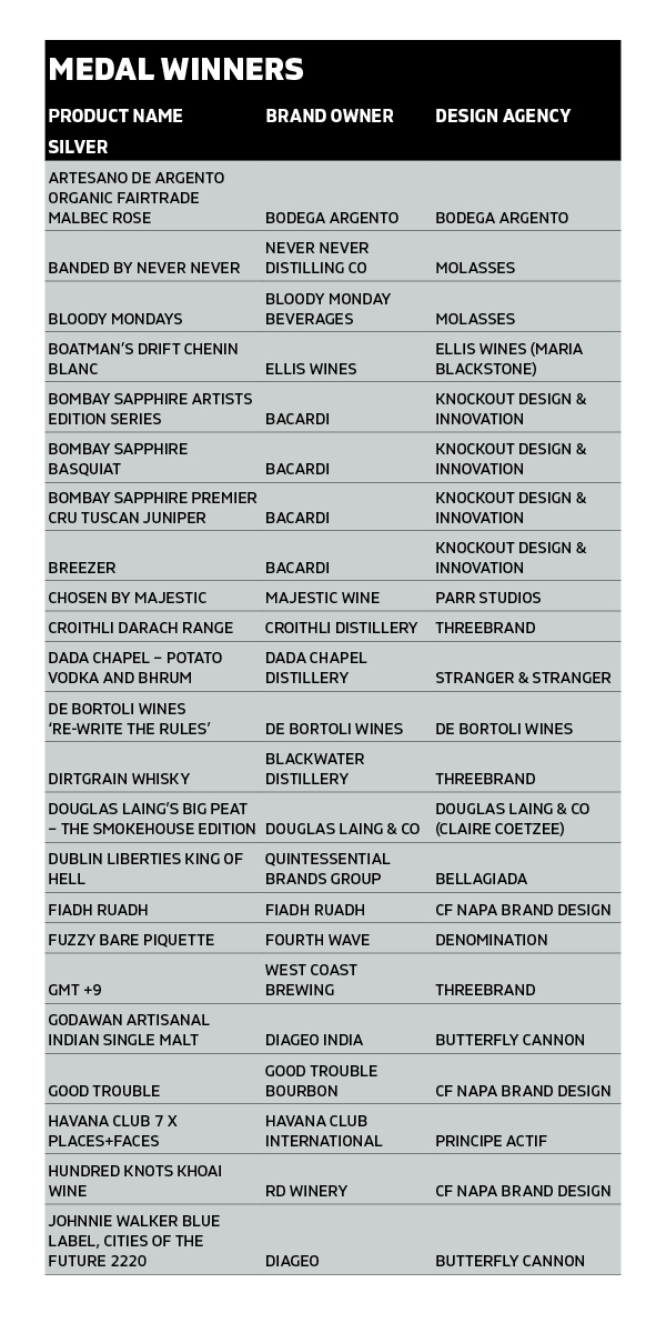
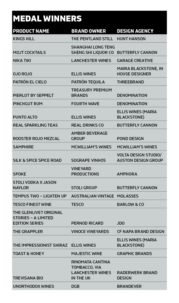
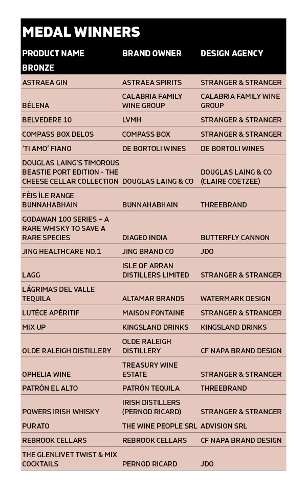
The results in full: